It takes more than simply putting a message on display to create successful digital signage. Your material must be well-designed, aesthetically pleasing, and simple to grasp if you want to really engage your audience and encourage interaction. Following the right design guidelines can make all the difference whether you're making menus for restaurants or promotional materials for businesses.
In this blog, we’ll cover essential design tips for sign creation and explore how to design a sign that stands out and communicates effectively.
Understand Your Audience and Objectives
Before diving into the design process, it’s crucial to define your goals and understand your audience. Ask yourself:- Who is your target audience?
- What action do you want them to take?
- Where will the sign be displayed?
Keep Your Message Clear and Concise
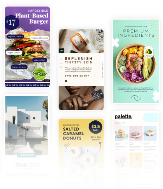
One of the golden rules of how to design a sign is simplicity. Digital displays are often viewed for only a few seconds, so your message must be clear and concise. Avoid overcrowding the screen with too much information. Instead, focus on a single key message or call-to-action (CTA) that grabs attention immediately. For instance, digital menu boards in a café should highlight popular items, special offers, or combo deals in a visually distinct way, seeing to it that customers can make decisions quickly.Use High-Quality Visuals
Digital displays rely heavily on visuals to capture attention. Low-resolution images or poor-quality graphics can make your signage appear unprofessional. Always use high-definition images, sharp icons, and clean fonts to create a polished look. When creating retail signs, make sure the product images are clear and appropriately depict the product you are marketing. When it comes to digital signage for windows, use images that are vivid, striking, and noticeable even throughout the day.Leverage Colour Psychology
Colours have a significant impact on how your content is perceived. Use colour schemes that align with your brand while considering their psychological effects. For example:- Red: Creates urgency and grabs attention (ideal for sales and promotions).
- Blue: Evokes trust and professionalism (great for corporate messaging).
- Yellow: Conveys happiness and energy (perfect for promotions targeting younger audiences).